A brand and identity redesign for an NGO that works to empower and employ people with disabilities (PwDs).
Observation
people don't trust NGOs
iFTC had a mission worth funding, but…
Claim
nothing about it said so.
IFTC approached me to redesign their brand because, on the face of it, they felt the look and feel of their brand assets “wasn’t cohesive”. At face value this sounds perfectly reasonable, but when I dug some more to find out the root cause, I found:
01
What are they asking?
For a redesign of their brand assets to make it more cohesive and designed.
02
Why are they asking this?
Because they are not able to get the funding and traction they want, either from partnerships or word of mouth.
03
What is the root cause of this?
In the Delhi/NCR region, people harbour a deep distrust of NGOs because most are insincere and opaque: there is no clear correlation between what goes in and what good comes of it.
causesattributesoutcomes
site looks shoddylow organic spreadpeople don't trust NGOsNGOs are treated like charityneeds to look top notchneeds to be memorableneeds to be trustworthyneeds to put makers firstneed fundingneed to spread awarenesswant no pityWhat I got from this was that “charity”, “sympathy” and “pity” are unreliable and unsustainable motivators, which also associate the brand with other NGOs that are looked at poorly.
For empowerment to be more than symbolic, it must sustain. The best way to do that is by creating a brand and products that can stand on their own right, do not hide the cause they are empowering but at the same time don’t ask for pity. Clarifying the true scope of the problem made it much easier to arrive at the true brief:
How might we
(through branding and visual identity) get corporates and HNIs to buy into IFTC’s vision of empowering PwDs, to achieve funding opportunities and organic sales without relying on unsustainable motivators like sympathy and charity?
Handling the brief in this way is not without risk. The massive upside of relying on such motivators as charity and sympathy is that the standards are different (which is exactly what makes it false empowerment). By adopting a stance of “true empowerment”, there is nowhere for poor product quality or branding to hide.
noun · /trænˈspær.ən.si/
the characteristic of being easy to see through;
a situation in which business and financial activities are done in an open way without secrets, so that people can trust that they are fair and honest.
Radical Transparency builds trust through honesty.
In today’s era, everything is an ad. People are constantly being sold on something.
Being self-aware, authentic and not “pretending” is the human touch people crave.
Nobody else in the disability sector does this because for them the opacity is a shield from accountability.
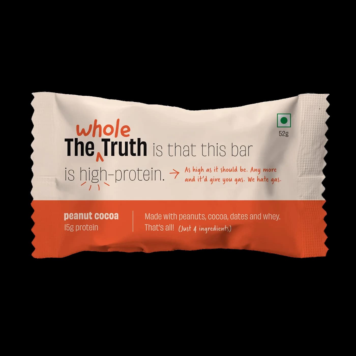
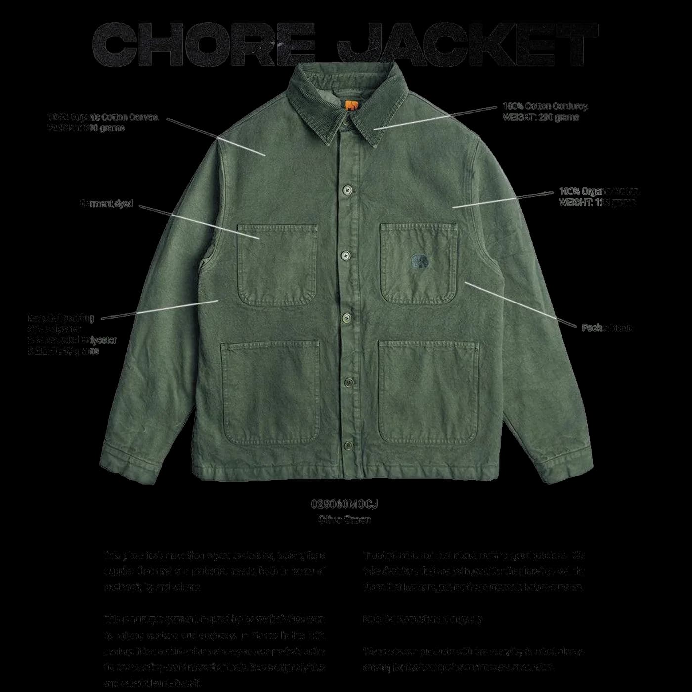
01
Maker first
The NGO exists to serve the beneficiaries, so the beneficiary who makes the product is chief, and the benefit to them is clearly stated (pricing).
02
Matter of fact
True equality requires normalisation, so the beneficiary's disability is stated as a fact, not put as a cause for sympathy.
03
Conversational
Trust is built through conversation, so the tone should reflect this and be conversational and human.
The embedding of accessibility and equality into the branding should also be embodied in the type. So when looking for typefaces, legibility and accessibility was a generative constraint.
Abc
Atkinson Hyperlegible Next
headings and body
Built by the Braille Institute for low-vision readers: I, l and 1 and O and 0 are drawn apart, apertures are large, counters open. For a brand about access, the typeface itself is proof of the claim.
₹120.00
Atkinson Hyperlegible Mono
figures, labels, the maker's label
Same legibility, fixed width. Numbers line up, and dates and prices read as a record rather than a slogan, which is where the label's honesty comes from.
not pity. dignity.
Fraunces
statement lines only
One line per view that draws attention. A soft, human serif against two hyperlegible sans faces: the moment the brand speaks like a person rather than a report.
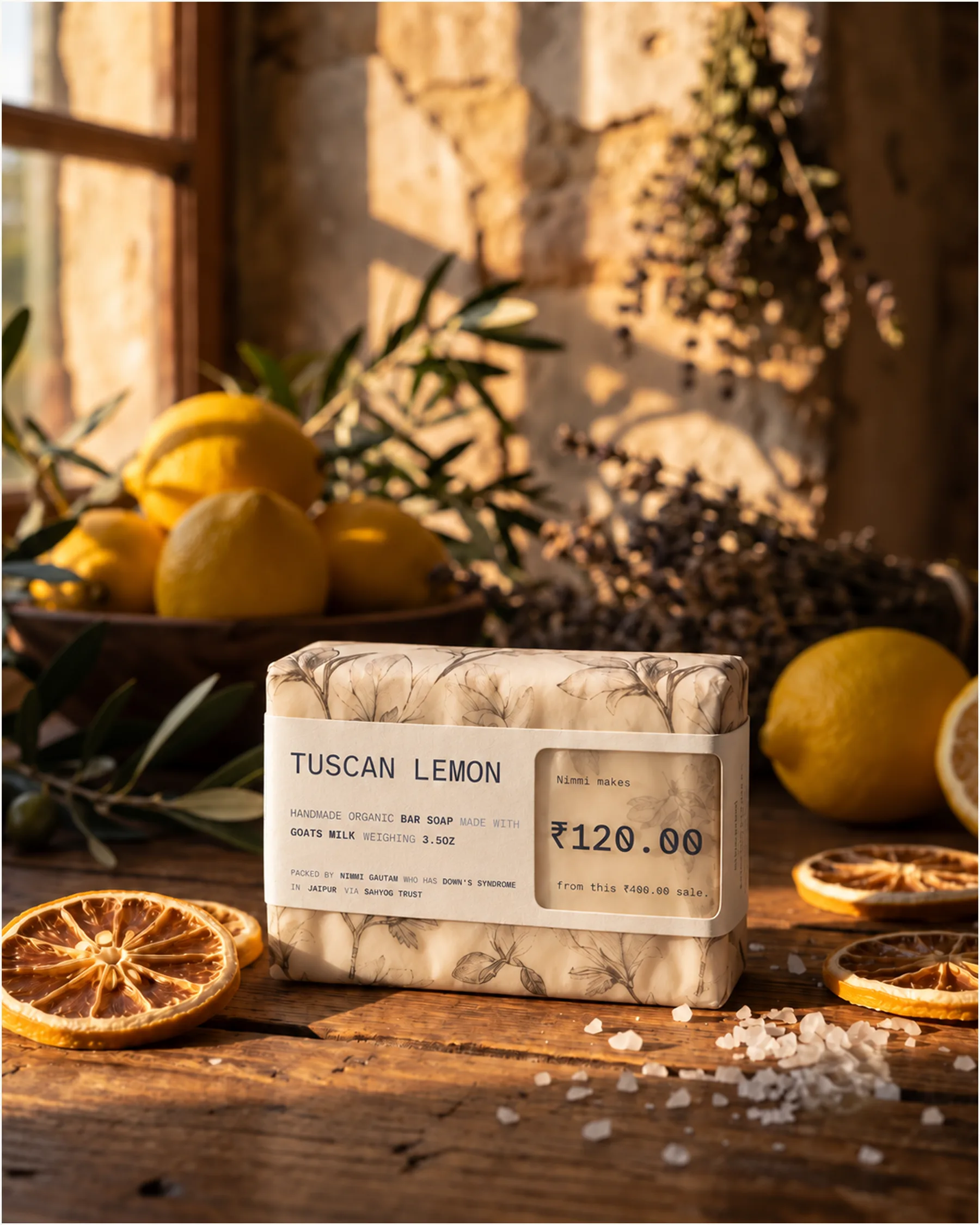
With this in place, the positioning could then be distilled into the most basic element: the maker’s label.
made by
Nimmi Gautam
who has Down syndrome.
on 14/07/26 in Jaipur via Sahyog Trust
Nimmi makes
₹120.00
from this ₹400.00 sale.
the maker’s label · specimen data
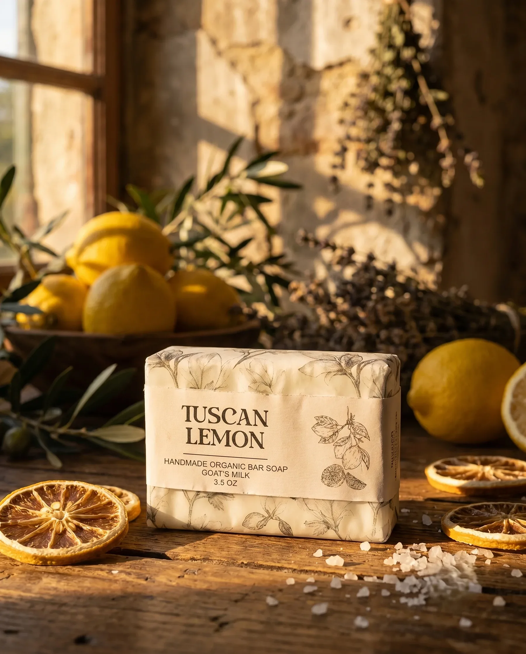
Which then allowed me to turn to packaging. With physical products, the “transparency” principle could be applied literally: all packaging must give a clear look into the actual product, unadulterated.
Mark
Icon
Spacing


